

Imitation is the sincerest form of flattery and in the world of ecommerce, it’s the path of least resistance. Each website has its own unique customer base that reacts differently based on their psychographics, age, and demographic profile. However, there’s a lot of good stuff out there to consider when designing a new product detail page or PDP. And it’s a good idea to check out some of the best as you consider which changes need to be made on your side. Let’s start with the why and then see how to make world class product detail pages.
Why Product Pages are Critical
Let’s start with a critical concept to great ecommerce: every page on your site is a homepage. If you take the various page types: homepage, content pages, category pages, product pages, etc, you’ll realize that in most cases you have more product pages on your site than any other page. And they often drive a disproportionate amount of organic search traffic, especially if you’re ranking well for long tail keywords. The folks who show up on a product page for the first time might be completely unaware of your brand. They are searching for a product to fit their needs versus a new brand. They are buying, not just shopping around. So high intent, but often low brand awareness. Great new customers to acquire.
Because of this, product pages typically have high bounce rates when they have good new entrance numbers. And a 10% improvement to your product page layout can dramatically lift conversion rates. If you need to spend time on your site, spend it on the product page rather than the homepage. A great product page is more important than a great homepage. This is true on every ecommerce website. Period.
Side note: Apps are mobile sites that run a little faster and a little smoother. However, in apps everyone starts with the homepage and has to work down to the product detail page. Make sure you don’t think about your app the same way you think about your website. Completely different approach and usually it’s only your best customers using an app.
Where to start on Product Pages
In my experience, I’ve seen lots of different ways to craft a strong product page. The big pieces are obvious, but the hard part is making it all work together. The key question: does the customer have all the details to make a decision? Are you highlighting the key benefits of your product? And do the images/video really give customers an understanding of what they are buying?
If you can effectively get this across, you’ll have a winning product page. It will enable you to drive sales better than your competition. A highly converting product page means you can spend more in paid marketing, do more in social, and generally beat your competitors. Here are the critical parts of an ecommerce product page to examine:
1. Images & video. Websites sell images. Make sure yours are big and clear. They should show all the details of each item. And video can double the page conversion rate if done well.
2. Product copy/details. Five years ago a sentence or two was okay. Now you need to make sure to blow this out. Be clear about the products benefits to consumers (the Why). Include everything a consumer needs to make a purchase. The more information the better. I’m a big fan of icons that show product benefits easily and quickly. Add shipping/returns details. Sizing. Anything necessary to buy.
3. Add to Cart. Critical part of the page that should pop and draw the eye. We aren’t making art, we’re selling products. Make it easy to see and know exactly what to do.
4. Customer Reviews. Every sku needs customer reviews and you need to work on getting them. Ask customers directly for reviews (and explain that you depend on them – because you do). Make reviews easily accessible and use them to work on your merchandising over time.
5. Add Urgency. Give your customer a reason to buy now. Anything from “low stock” alerts to “already in five shopping carts” to “moving fast.” Find ways to add pressure to buy now and not put it off.
6. Interactive functionality. This became a thing with DTC businesses like Casper. Cool functionality that allows consumers to really understand a products features/benefits. This aren’t easy to add, but do add value to the customer. At least test these on good skus.
7. Cross-sells/Upsells. Make sure you’re suggesting alternative products (in case this one doesn’t fit what the viewer wants) and complementary products that work well with this one. More important in apparel or fashion type skus, but getting an add on product can help drive up AOV.
8. Social Proof. If at all possible include social proof on your page. Reviews help but I also recommend using hashtags and user generated content to show people actually using your product.
So let’s look at some killer examples:

Great Product Page: OnePeloton.com
Why it made the list: Peloton gets to take advantage of the DTC cheat code. Since DTC companies typically have a limited number of product pages, they can go all out on each of them. And Peloton makes the most out of their efforts. Great video with a nice energy and emotional feel really drags you into the page. But it’s more than that. Each section of this page drives you deeper into the products benefits. And they build out cool interactive features so that you can dig in where you have an interest.
I also love how they increase the options as you get lower in the page. For me, once I get to the bottom they mention that I can try the bike at Lenox Square (a nearby mall). Then they ask me to signup for email and get information on my first 30 days with the bike (their last grab to keep me in the shopping funnel). And for products like this, I love that they include a “see it in your home” augmented reality functionality. I don’t think you can walk away from this page without deeply understanding the Peloton bike.
Potential improvements: It’s hard to know exactly where to improve this one without looking at the analytics (which I obviously don’t have access to). However, they did skip the customer reviews. My opinion is that the reviews would be strong (based on friends/family talking about Peloton) and probably help seal the deal on a wavering customer. The other piece that I notice is missing is a comparison of this bike to some of their other products. Comparison charts are great for the data-focused shopper. Some people need to know the specs before they buy and those types of tools can really help. Otherwise, this is just a killer product page.
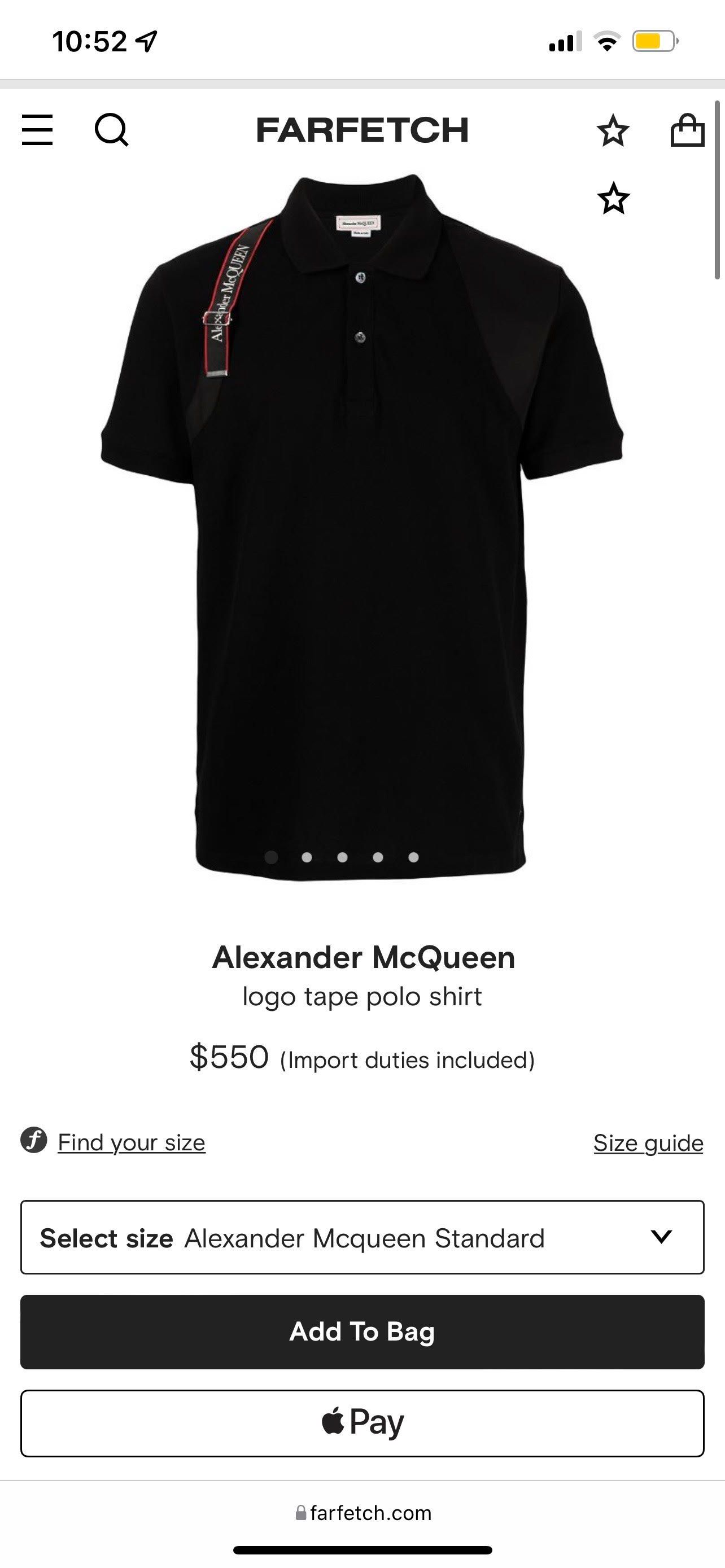
Great Product Page: Farfetch.com
Why it made the list: This is an excellent product detail page with clean, clear design. Lots of great imagery about the product, copy includes everything you need to know and they also include details like what else the model is wearing an a custom size chart for this designer. They include a size finder tool as well. Notice that Farfetch offers one click checkout for iPhone wallet users, which is a bonus if you’re shopping on mobile (everyone shops on mobile now). And I think the “Complete the Look” section is a nice way to tie in other skus.
Potential improvements: No product page is perfect and there is always more to do. This one is missing a couple of pretty critical pieces: customer reviews and video.
Customer reviews are most important to millennial and Gen Glass/Z consumers, so it’s interesting that Farfetch doesn’t have them. I’m guessing this is because their brands don’t love seeing critical reviews (on a $550 polo shirt). But for 99% of ecommerce sites I would strongly recommend customer reviews.
Video is becoming more and more important to web shoppers. It bridges the gap between in person store shopping and online. Traditional digital commerce is a lot about selling pictures. But video can give consumers a deeper understanding of what they buying. I always recommend you create a product video for your top 25 skus and measure the impact. It’s usually bigger than expected. I think Farfetch could improve this page with a quick video of the model wearing the shirt.
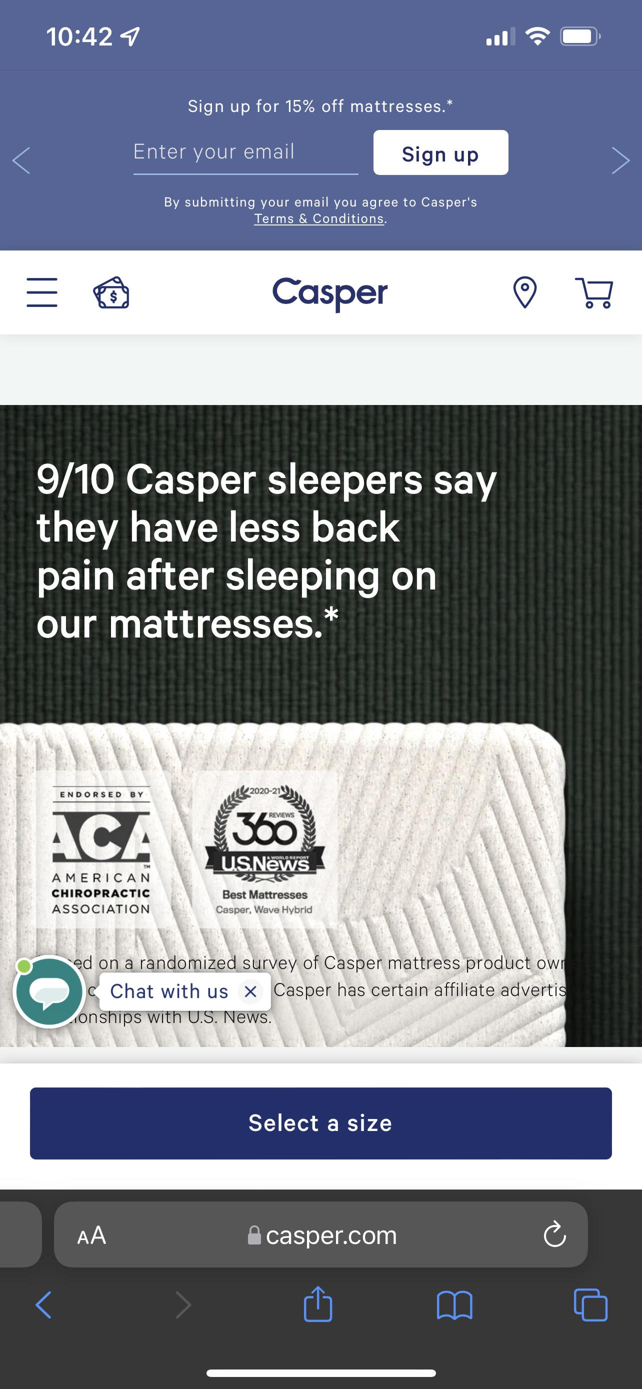
Great Product Page: Casper.com
Why it made the list: Casper is still the king of DTC mattresses for a reason: they are excellent at executing in ecommerce. Like Peloton, they do have the luxury of focusing on a few key products versus thousands like traditional ecommerce companies. But they do it well. Casper has great video, nice photography, interactive functionality to walk you through their product and great reviews (they aren’t missing those reviews). The video “See how it’s made” is a nice way to show value and pull you into the brand. They also do an excellent job at social proof from reviews to quotes from news sites to survey data like 9/10 people say it improves their sleep.
Potential improvements: This page is here because it is exceptional. From a design standpoint the page feels crowded to me and I wish they would let it breathe a little more (more whitespace). But it hits all of the key pieces of a great product page and is extremely well thought out. You want to buy one just looking at it.
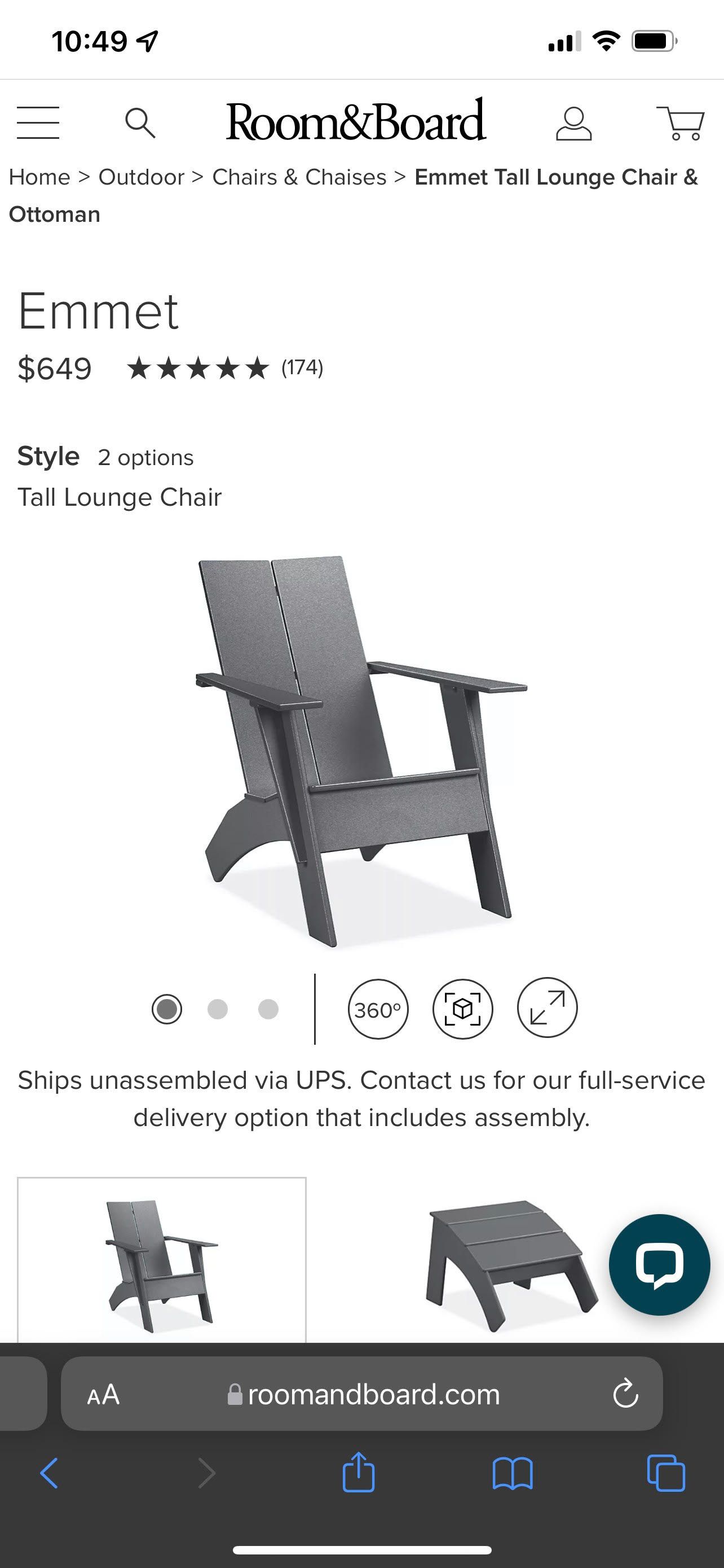
Great Product Page: RoomAndBoard.com
Why it made the list: Selling furniture online is no easy task. But they do an excellent job in my opinion. Great photos and they add in something not seen yet: 360 degree imagery and augmented reality see-it-in-your-room capabilities. Plus they go deep into the details of the style with pieces like “Meet the Minnesota craftspeople” (!!) and ideas and advice. But I think what really seals the deal is their use of customer generated content to show the furniture live in consumer’s homes. It allows you to imagine the upgrade to your house.
Potential improvements: Immediately I would suggest icons. Made in America. Maybe the type of wood this sku is crafted from, etc. And video is still a miss for these guys. I would like more of the professional photos as well. Also some interactive tools might help you really understand what you’re buying. Overall a strong site, but they could still improve their sales by adding in more in my opinion.
Okay, okay. I feel like I could go on forever. Bottom line is that Product Detail Pages are the most critical page on any ecommerce or direct-to-consumer website. A high performing PDP enables you to spend more on marketing and generate more customers. It’s the secret sauce to executing ecommerce well. Make sure your PDP pages perform. If they don’t, focus first there and then work on other pages of the website. This is the one thing you need to get perfect.